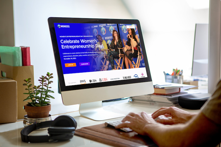
WOMEN’S ENTREPRENEURSHIP DAY ORGANIZATION (WEDO) was founded in 2013 and established to bring awareness to the 250 million girls living in poverty globally that deserve to be given a chance in life, while simultaneously inspiring and empowering the 4 billion women on the planet. With the upcoming annual conference, the team wanted an updated look-and-feel.
CLIENT: Women’s Entrepreneurship Day Organization
DELIVERABLE: Website Design
Tom is a talented and amazing designer, with a sharp eye for aesthetics. My previous design was barebones and needed to pop, and he turned it around with a beautiful layout, color, and typography.
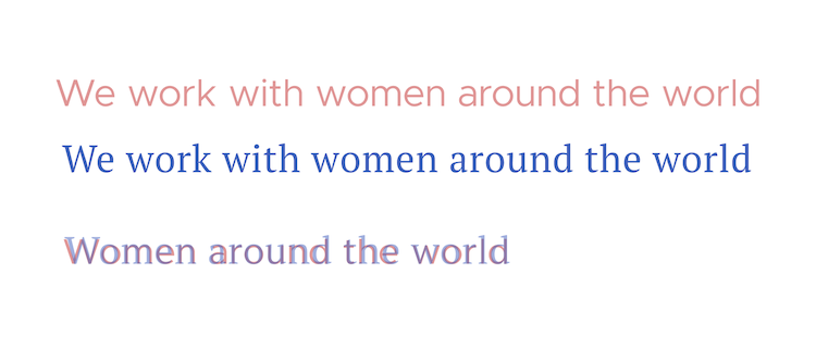
FRIENDLY, MODERN, TECHIE were the primary attributes surfacing in our brand discussion. On the typography front, Metropolis was utilized for the headings. The modern geometric shaped letters and angled terminals gave that needed friendly tech vibe. For the body font, PT serif was utilized with its high legibility and modern feel. In addition, with the techie brand strength more on the subtle to moderate side of the spectrum, I wanted to ensure these fonts matched well.
Selected type

Type skeleton comparison

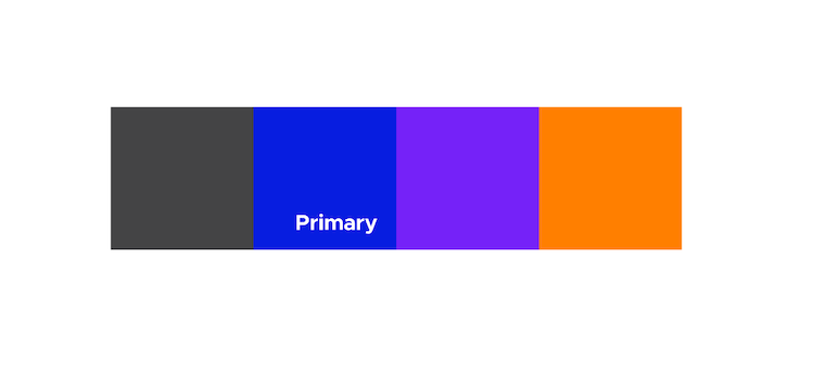
AS WE MOVED INTO DISCUSSIONS on color, the main requirement was to keep the bright, highly saturated blue from the previous design. Pink was contender but was removed from consideration as the team wanted a more unique palette, different from peers and the industry. Keeping with the techie feel, highly saturated and bright colors were chosen.
Color palette

TO SAY THIS ORGANIZATION has a lot going on is an understatement. In addition to the annual conference, there are number of events going on all year round, throughout the globe. A section was added to increase visibility to these initiatives, and let visitors know how they could get involved and help.
Homepage screenshot

Let's Get Started!
Reach out and connect. At the end of the day, each one of us has the same goal, to push our dreams to their potential and make them a reality. I’m happy to just talk through your ideas and act as a sounding board. Let me know what works for you.
– Tom