3 Quick Tips To Break Down Text Walls

One of the biggest culprits for low engagement is a text wall. We all fall into this trap; it’s hard enough finding the time to get your thought down, grammar check, spell check, upload to the web, etc., etc., etc. Unfortunately this frequently ends up in a unfriendly format for the eyes and will under utilize all your hard work. Fortunately, there are a few tools to quickly tear down that text wall and make it friendlier for your visitors (and their eyes!).

Headings

When you started writing your piece, you probably had a rough outline of the structure of the copy…these are essentially your headers. They are the sign posts, indicating where we are and the sub-topic or focus. Headings are a great resting spot for you visitors eyes. “Readers like to scan content to understand the text and decide which sections they will read. Headings help them do that. Scanning the text becomes significantly harder for your readers when it contains no headings. It’s even worse when you add long stretches of text after a heading.” *
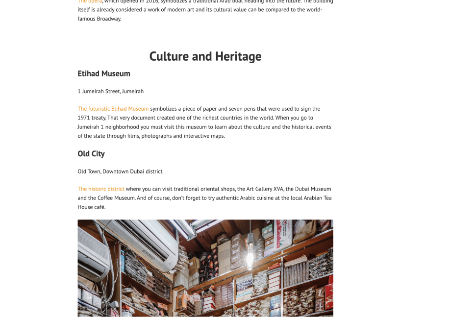
screenshot of copy from travel blog
Great use of heading and subheadings throughout the page. Note the use of increased font weight to make the headings more noticeable. Someone interested in traveling to Dubai, would be able to scan this page in 15 seconds.

Accordions

These design elements allow you to toggle the view of the content when clicked. They have a title always visible and an icon you can click, which then transitions to display your content. Depending on your website implementation, these widgets may have a different name, like collapsible block or toggle list.
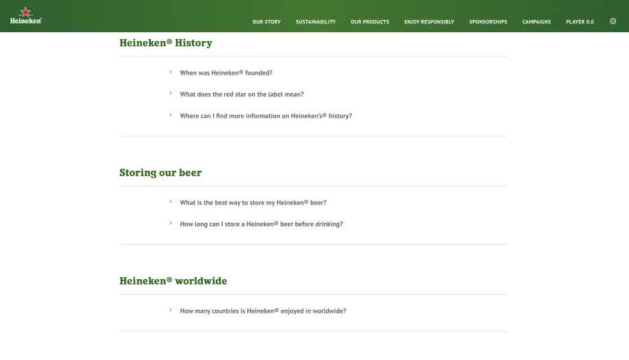
screenshot from heineken webpage
Heineken does a good job saving space on the page and only presents high level information via the questions, until the visitor clicks on the icon.

Pull Quote

Pull quotes, like headings, draw a lot of water in grabbing attention.
For the visitors reading through your content, it provides a nice break and re-emphasis on your key point. For the folks unsure if this article is for them, it aides in scan-ability. 

Visually they can be very different from your copy text. Some of the best designed pull quotes greatly vary size, font family, and font weight.
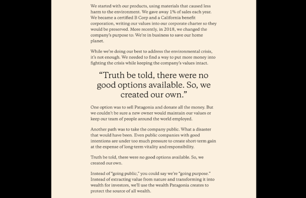
screenshot from Patagonia website
Patagonia re-used a key point from the article, increased the font size & weight, then dropped it in the middle of the page. A perfect means to break up all that text (and emphasize the message).
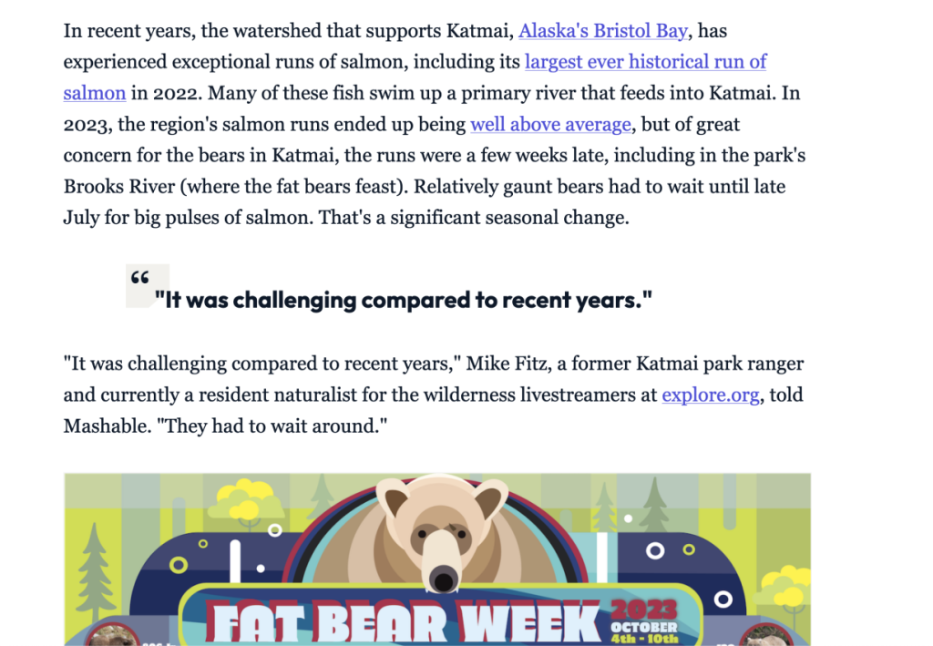
screenshot from mashable
I had to include this one. Who doesn’t love Fat Bear Week. Check out the styling on the pull quote. The article copy was in a serif, so they used a sans-serif and bumped up the font size and weight…and added some visual interest with that open quotation.

This is by no means a complete list of tools to handle text walls but these are three of the most common and effective you can use after-the-fact. If you have any questions or need some help with your copy, reach out.

Cover photo by Pete Willis on Unsplash

* How to use headings on your site- https://yoast.com/how-to-use-headings-on-your-site/

Tom Cushna web designer in Davis California

Hello! I’m Tom, the creative force behind Spadefoot Studios, a web design agency based in Davis, California. With years of experience in web design, I create dynamic, user-friendly websites that stand out. Whether you’re looking for rebranding assistance or a freelance web designer to bring your vision to life, I’m here to provide innovative solutions tailored to your needs. Let’s connect and unlock the opportunities that will elevate your brand and online presence.

Scroll to Top