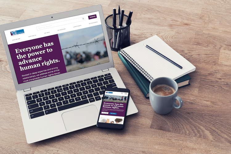
ROOTED IN DEEP LEGAL EXPERTISE AND STRONG RELATIONSHIPS, the Advocates for Human Rights works on an international scale to counter some of the biggest violations of human rights. This bold approach is rooted and achieved through a broad range of volunteers that help educate and advocate across the globe.
The Advocates recently started a high priority public phase of a capacity-building campaign and needed an updated website presence.
CLIENT: The Advocates For Human Rights
DELIVERABLE: Website Design
We were under pressure to launch a website and we got it to a place where it was doing what we needed it to do, but it's not quite there in terms of polish. We do not have a designer on staff and have been getting by copying elements from designs we like but that has led to a lack of cohesion.
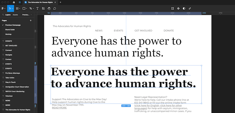
OUT OF THE GATES, we had a solid start with established brand guidelines, which included the color palette and typography. After we reviewed these recommendations, we explored and identified the adjectives that best identified the organizations brand. Modern, clean, authoritative quickly rose to the top and were used as our cornerstone descriptors.
Georgia, a transitional serif, with its interesting letterforms at larger scale felt like the perfect fit for the big, authoritative headlines. Montserrat, a geometric sans-serif, is very clean and neutral, which we used for the body text and sub-headlines.
Interim screenshot working with different fonts in Figma.
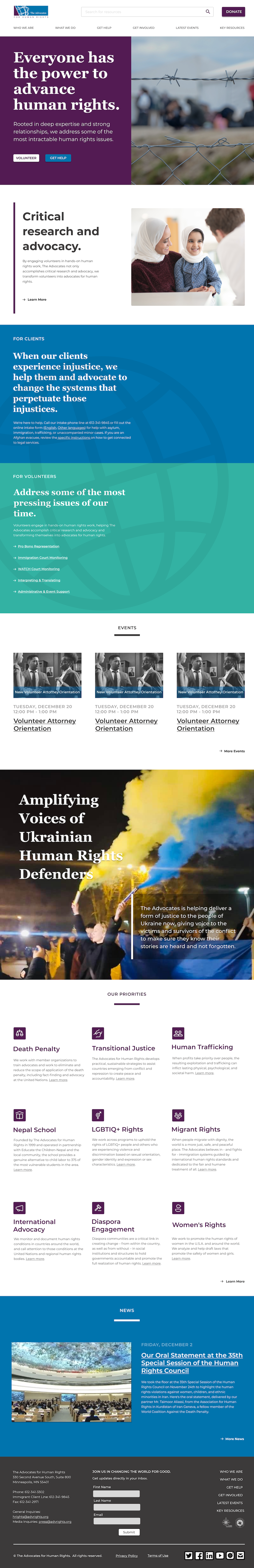
RECENT STUDIES INDICATE TALLER PAGES correspond with higher user engagement rates. Web visitors are used to scrolling and scanning for key pieces of content not only in apps but also webpages. The current site (beyond the homepage) had a large amount of very useful content for different audiences. My goal was to provide visibility to each of these areas, where users could scan and dive deeper where needed.
Updated homepage design.
Reach out and connect. At the end of the day, each one of us has the same goal, to push our dreams to their potential and make them a reality. I’m happy to just talk through your ideas and act as a sounding board. Let me know what works for you.
– Tom