EARLIER THIS YEAR I ATTENDED a client retreat with the Beautifully Flawed Foundation in Southern California. At these events, women and men who have experienced limb loss get a chance to experience a wide range of inspirational group activities, including a surf day. It’s here where I met the You Matter founder, Donna Quach. Her organization is composed of a group of mental health therapists who help a number of groups, including our military veterans, with a range of mental health issues.
CLIENT: You Matter – Not Alone
DELIVERABLE: Website
Tom was so helpful with helping redesign our non-profit website to give it the "feel" that I wanted. He was patient and always readily available to answer any questions. I highly recommend him as he is a very talented web developer.
Donna Quach, Founder
MODERN, FRIENDLY, APPROACHABLE were a few keywords we captured during our first brand meeting. For the design, I wanted this interaction to flow through the different design elements. For the typography, I chose Ubuntu as the headline with its modern and humanist qualities.

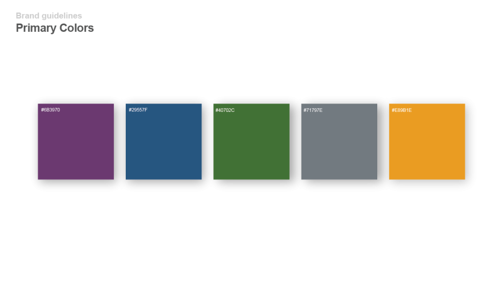
DURING OUR BRANDING DISCUSSION, we decided to move with uplifting, approachable colors. The purple in the original logo (with the puzzle piece) had a large amount of red, so we decided to decrease this level and make it a bit less feminine. Although logo modifications were not part of the original scope, it was important to carry consistent brand colors throughout the online presence.
Updated logo.

Final logo.
WITH COMMUNICATION PLAYING such a vital role in helping others, I wanted something to symbolize this throughout the site, like a motif. The result was a a conversation bubble, which is basically a border box with three rounded corners.
Homepage screenshot.

Sample secondary webpage.

Let's Get Started!
Reach out and connect. At the end of the day, each one of us has the same goal, to push our dreams to their potential and make them a reality. I’m happy to just talk through your ideas and act as a sounding board. Let me know what works for you.
– Tom
