Beautifully Flawed Foundation
FOR THE PAST 2 YEARS, I have had the privilege of working with Friends of Bethany. Our partnership started with a website revamp and continued with maintaining the site, adding an online shop, and designing a logo for their new retreat for men, The Forge. In late 2020, after experiencing a surge of growth, the organization “began to sense a changing of the tides”, and a need to expand the platform for others to shine with their stories of hope. Sarah Hill, the Executive Director, asked if I would head the new brand design and logo for this effort, and then echo this change throughout the website.
CLIENT: Beautifully Flawed Foundation (FKA Friends of Bethany Hamilton)
DELIVERABLE: Logo and rebrand current website
GIVEN THE SCALE AND DEPTH of this change, we went back to the drawing board. The core team walked through my branding questionnaire, addressing several cornerstone items such as the brand personality. With of all the excitement it was tempting to move quickly through this phase, but the core team steadily walked through the future vision of the organization and left no stone unturned.
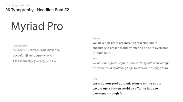
After exploring and drafting the updated branding, we turned towards existing design elements like the color palette, typography, and logo.
Sample page from brand guide.
THE PREVIOUS LOGO included a silhouette of Bethany Hamilton and the foundations name “Friends of Bethany”. The typography is a combo of a hand-written script and a custom san-serif, which gives it an informal feel. I’m personally a big fan of this work. It’s simple, clean and speaks to the mission of this organization.
Bethany’s image was a big component of the previous logo, which required a new concept all-together. My goal was keep a similar feel (as determined from the brand exercise) but make it less focused on Bethany.
Tom was wonderful to work with, and worked tirelessly to perfect the logo. I am so thankful to have him as a part of our team! We love our new logo! So thankful for his hard work to get us to the perfect look for our rebrand!
Sarah Hill, Executive Director
SURFING IS A MAJOR PART of this organization’s history, and also one of the most popular activities during the retreats. It was important to keep this unique aspect of the organization and also include a beachy and informal feel. After walking through the three final options (we started with 20 initial concepts), the core team and the board selected the wave logo.
The final three logo options.


Final logo.
Updated page from the existing website.

Let's Get Started!
Reach out and connect. At the end of the day, each one of us has the same goal, to push our dreams to their potential and make them a reality. I’m happy to just talk through your ideas and act as a sounding board. Let me know what works for you.
– Tom
