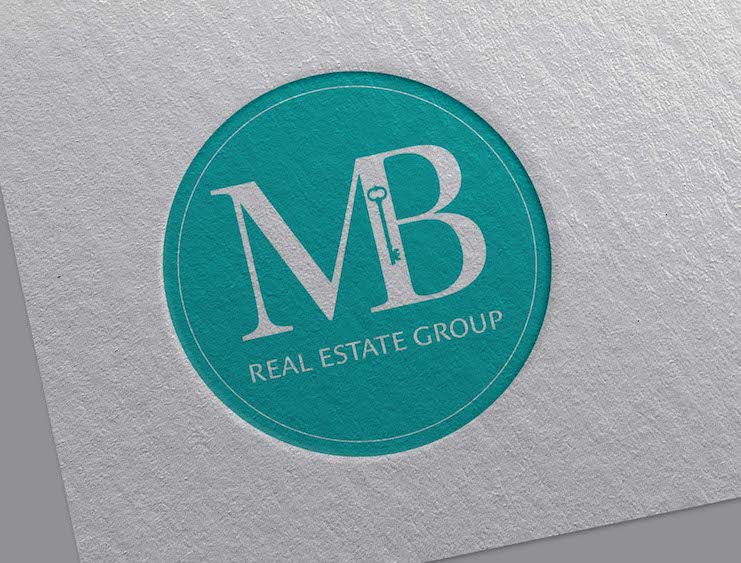
RECENTLY I HAD THE PLEASURE of working with a local (Davis, California) real estate firm, updating their logo. The previous version had several glimpses on the group’s brand personality but lacked the complete picture.
CLIENT: MB Real Estate Group
DELIVERABLE: Logo
AFTER OUR INITIAL PROJECT BRIEFING, it was very evident, time was the biggest constraint. Due to external demands, the team needed the finalized logo within a week. With such an aggressive schedule, it’s very tempting to jump right into Adobe Illustrator and start grinding. I’ve made that mistake in the past and thankfully learned to always start with my branding exercise. These are my guide posts, not only for logo creation but also later deliverables, like websites.
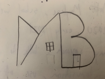
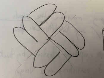
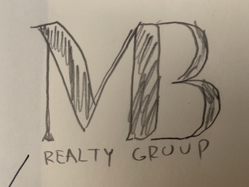
FRIENDLY, BRIGHT, SERIOUS, APPROACHABLE were a few of the brand attributes that surfaced in our discussion. After learning a bit more about the company history, market, and audience, I put down some rough sketches to see what would stick. Nothing is faster than a pencil and paper, which were critical in this project time-frame.
Initial pencil sketch options for the logo.
It was refreshing to work with Tom! He made the process of rebranding so simple for our team. He was flexible and timely! He was able to take our ideas and make them even better with his eye for design, while ensuring our logo reflected who are in both color and font choices. In the end, we have a gorgeous logo we are excited about! Thank you Tom!
MB Real Estate
PENCIL SKETCHES ARE USUALLY not shared with my clients. My preference is present a more polished, digital format. Little details, like in the typography start to come out, and can make a huge difference in the interim decisions. This project was an exception, given the tight schedule. After some feedback, I moved the top contenders into Adobe Illustrator.
Additional logo options.


UNLIKE MOST RELATORS who work sales as individuals, the MB Group is a full-service shop, which requires a team effort. To have this notion comes through I combined the “M” and the “B” to reflect their brand; it’s about what the team can do for their clientele (the sum is greater than the individual pieces). For reference, the “M” and “B” stand for McDonald & Baroody, the original members of the team.
THE TYPEFACE SELECTED was Utopia Std. The formal feel of the serif – plus the high contrast – gave it a modern feel. After the “M” and “B” were merged, I trimmed the upper serif from the “B” as it was pulling the eye from right-to-left (and across to the upper serif on the “M”). Then, to balance the weight between the “M” and “B” is slightly increased the width of the stroke in the “M”.
ON THE COLOR FRONT, our initial selection was more of a deep blue to help symbolize trust (since buying a house is usually one of the biggest purchase some will make). This felt too formal and less approachable, so we added a bit of green to make it feel more welcoming and further align with MB’s brand personality. The final combo was 73% blue, 67% green, 4% red.
Final logo.
Black and white variations.

Let's Get Started!
Reach out and connect. At the end of the day, each one of us has the same goal, to push our dreams to their potential and make them a reality. I’m happy to just talk through your ideas and act as a sounding board. Let me know what works for you.
– Tom
