MAKANALANI PROVIDES LIFE CHANGING CAMPS to children who can’t afford the opportunity. Nestled on the north side of Kauai, kids experience nature on a 130-acre farm surrounded by animals and the beautiful Hawaiian scenery completely free of charge. The beautiful campus and program needed an updated web presence to reflect their amazing cause. I was connected to Makanalani by one my favorite clients, the Beautifully Flawed Foundation (f.k.a. Friends of Bethany).
CLIENT: Makanalani
DELIVERABLE: Logo and website
Tom is wonderful to work with! He's responsive to feedback, timely, and great at his job. He made my- somewhat detailed- vision into a reality and really delivered a quality logo / website.
Makanalani Operations Lead
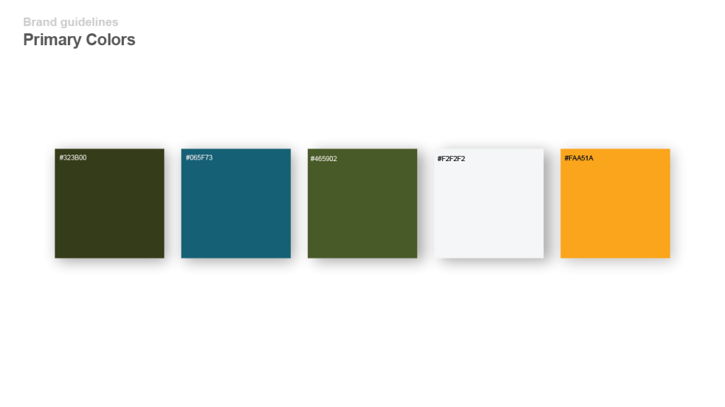
NATURAL AND APPROACHABLE were some of the key brand keywords identified earlier in the project. Working with this baseline, a color palette was established to put these brand attributes into play. The team wanted the colors to represent the beautiful, welcoming surroundings of the campus, which is why we included the deep blue and greens.

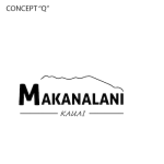
THERE WAS NO SHORTAGE of inspirational photos and stories. Ultimately, we settled on a modern representation of the mountains surrounding the camp.
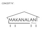
Some of initial logo concepts.


Final logo.

Homepage screenshot.

Sample secondary webpage.

Let's Get Started!
Reach out and connect. At the end of the day, each one of us has the same goal, to push our dreams to their potential and make them a reality. I’m happy to just talk through your ideas and act as a sounding board. Let me know what works for you.
– Tom
