
Nonprofit Website Design & Implementation
THE BEAUTIFULLY FLAWED FOUNDATION offers support and guidance to individuals who have experienced profound limb loss. Over the past few years, the foundation has expanded its services, including the introduction of retreats tailored specifically for men. Additionally, the organization is relaunching large-scale events, marking a return to in-person gatherings after the hiatus caused by Covid. The current website was over five years old and needed a fresh design/redesign to reflect the organization’s current goals.
- CLIENT: Beautifully Flawed Foundation
- DELIVERABLE: Website design & implementation
- RESULT: 70% increase in engagement on donation content. 44% increase in engagement on retreats.
Challenges Addressed
As the organization evolved to include retreats for not only women but also men, accurately portraying its mission and identity became crucial, particularly for new donors unfamiliar with its work. Providing easily digestible information was key to building trust with potential supporters.
Solutions
We started the project with a brief review of the brand fundamentals. One key change was on the color palette, removing an infrequently used red and introducing a deep blue to bring in more of an ocean feel and a bit more masculine feel, reflecting the expansion of retreats for men. This rich blue became a primary color across the site.
Our second goal was to ensure clarity for new users about the organization’s mission. After brainstorming with the team, we identified three main program pillars: retreats, events, and care packages. These pillars were integrated throughout the site, including the triple-column hero video. During video’s development (for the homepage hero section), I experimented with different shades of blue as placeholders (while selecting videos), inadvertently discovering a tri-color background effect that elegantly emphasized the three pillars concept. This motif is now featured prominently across many secondary pages.

[FIGMA SCREENSHOT] Three blue columns initially used as placeholder for the videos. Unintentionally stumbling upon a tri-color background effect that accentuated the three pillars concept. “There are no mistakes, just happy accidents” per Bob Ross.
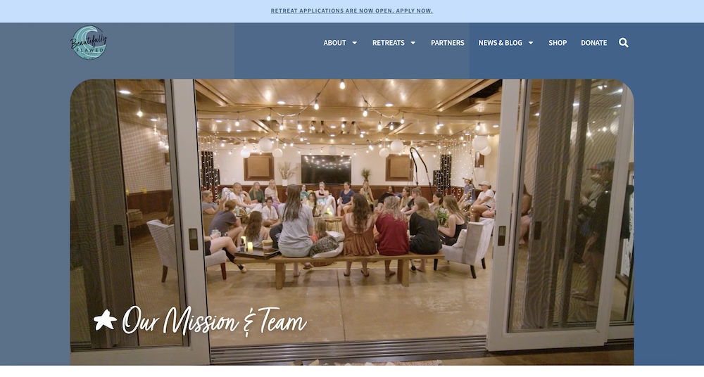
[WEBSITE SCREENSHOT] Three blue columns in use on the Mission & Team page.
Once we had the core pages built, we paused to collect feedback from outside the core team, specifically donors. We reached out to a current member and asked them to walk through the process of making a donation, assuming they knew little about the organization. The insights gained were eye-opening, revealing several areas for improvement that were subsequently integrated into the overarching design.
Collaborating with Tom was outstanding. He provided invaluable guidance throughout the process, and the end result surpassed our expectations. Tom's diligence, organization, and approachability made working with him a breeze.
Sarah Hill - Executive Director
Results
At the beginning of this project, we established the primary objectives for the website overhaul. It was crucial for us to have a method or a measure to track our advancements. We opted to utilize Google Analytics’ engagement rate metric to gauge our progress. Presently, the engagement rate for the donation process pages has surged by 70%. Additionally, the engagement rate for the men’s retreat has seen a notable increase of 44%.
Hello! I’m Tom, the creative force behind Spadefoot Studios, a web design agency based in Davis, California. With years of experience in web design, I create dynamic, user-friendly websites that stand out. Whether you’re looking for rebranding assistance or a freelance web designer to bring your vision to life, I’m here to provide innovative solutions tailored to your needs. Let’s connect and unlock the website opportunities that will elevate your brand and online presence.
Ready to Forge a New Path?
Whether you’re looking to revamp your current website or build something entirely new, I’m here to help you every step of the way. Get in touch today, and let’s turn your ideas into a beautiful, functional website.
