Web accessibility has emerged as a prominent and trending topic for numerous organizations. When executed effectively, it has the potential to enhance your brand and expand your audience. At its core, web accessibility ensures equal access to information, fostering inclusivity rather than exclusivity. An accessible website offers several benefits:
- Avoidance of legal issues and potential fines.
- Improvement of search engine optimization (SEO) rankings.
- Facilitation of equal access to content for all users.
While ADA (Americans with Disabilities Act) compliance is often associated with addressing visual disabilities, it extends beyond that to encompass auditory, cognitive, neurological, physical, and speech differences. Moreover, accessibility extends its benefits to individuals facing situational challenges, such as navigating a brightly lit environment.
A major challenge for businesses regarding ADA compliance is keeping pace with the constant influx of new content added to their websites. Often, content is urgently needed and gets published without thorough consideration of accessibility requirements. Here are some common ADA issues and corresponding tools to assist you in maintaining accessibility on your site.
Alternative text for images
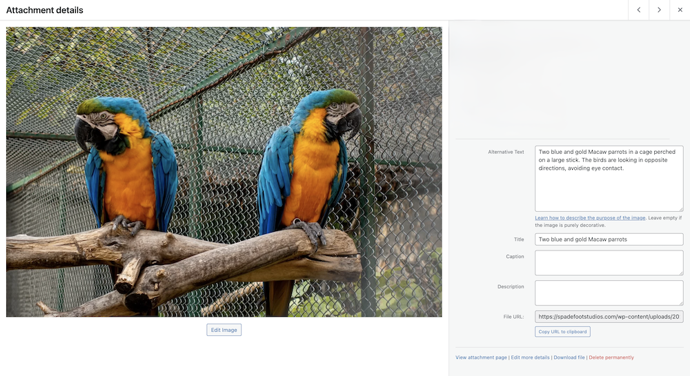
Also known as Alt Text, it is descriptive text that can be used in place of the image. In general, all images (informative and functional) need to have a description. The following example is Alt Text on an image in WordPress (via the media library).

In this example, the added text helps layout what’s included in the image and what should be conveyed in the image.
Indeed, decorative images serve a purpose solely for aesthetic appeal and do not convey meaningful information. In such cases, adding alt text is unnecessary and may even clutter the experience for users of assistive technologies. By providing a blank alt attribute (alt=””), you can effectively signal to screen readers that the image is decorative and can be safely ignored. This approach maintains accessibility while ensuring a seamless browsing experience for all users.

Auditing your site for Alt Text can be very time consuming. Fortunately, there are a large number of tools out there to help. SEOptimizer has a straightforward checker that scans a provided page URL and provides a list of images that are missing Alt Text. Once you have your list, head over to where the images are managed (media library in WordPress) and insert those descriptions on the images.
Insufficient color contrast
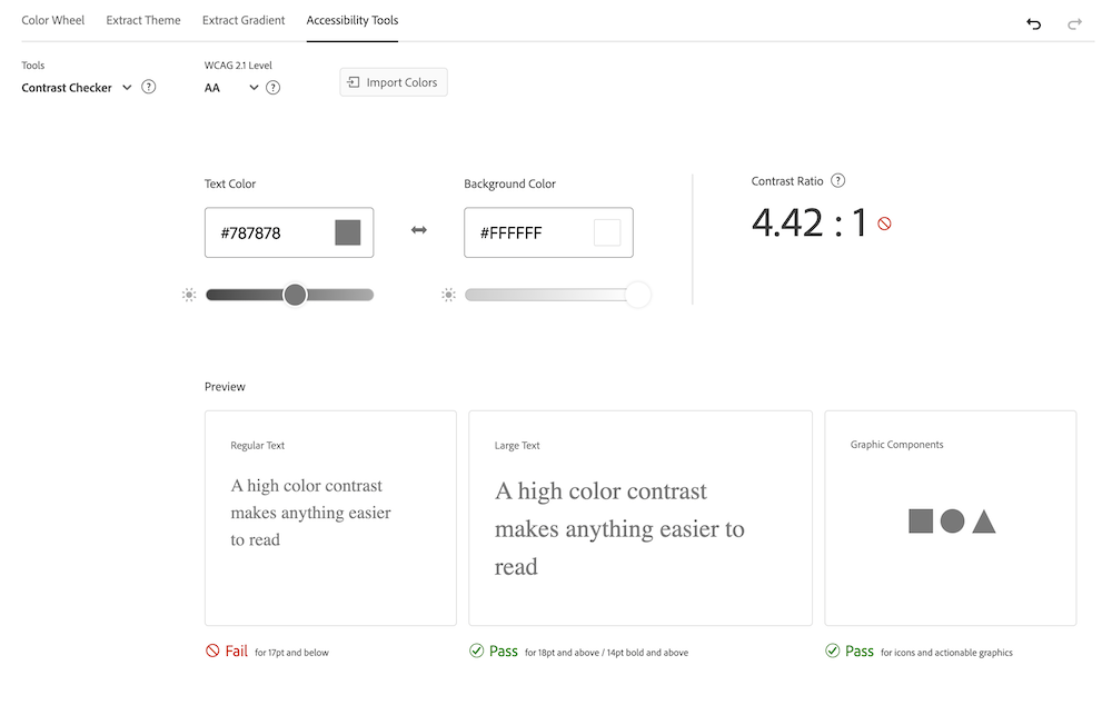
All text elements should have sufficient color contrast between the text in the foreground and background color. A common question is what is sufficient. There are several levels of compliance but what is considered acceptable is 4.5 contrast ratio for regular text and 3 for large text (18 pt or 14 pt + bold). Don’t worry about memorizing these numbers, just remember contrast requirements vary between the size of text. There are several applications out there to assist with the ratios.
One of my favorite tools is Adobe’s Contrast Checker. Plug in your text color and background color code and you can instantly see if there are any issues. In this example, the text color works well for large text and symbols but lacks sufficient contrast for regular text (17pt or below).

Embedding inaccessible docs
These non-HTML documents often require additional processing and are not recommended due to their limited accessibility. People using assistive technologies, such as screen readers, may encounter difficulties in navigating and comprehending the content within these files. While companies like Adobe have made significant strides in improving the accessibility of formats like PDFs, the overall experience with such files remains suboptimal.
HTML, the coding language of the internet, surpasses these challenges by allowing for marked-up text and tags that bridge the accessibility gap. This enables content to be more readily accessible to all users, regardless of their abilities or the tools they rely on. In essence, HTML fosters a more inclusive online environment by ensuring that information is easily accessible and navigable for everyone.
Accessibility Is Ongoing
Remember, ensuring accessibility isn’t a one-time effort; it’s a continuous process. As you and your users continue to add content online, maintaining accessibility should remain a priority. Recognizing that perfection is elusive, many organizations conduct regular audits, often on a quarterly basis, to safeguard against any oversights.
Beyond alt text, color contrast, and inaccessible document links, there exist several other ADA compliance issues. However, these three are arguably the most common within this context. Should you have any inquiries, please don’t hesitate to contact me.
Sources:
- W3.org Decorative Images
- W3.org Accessibility Introduction
- W3.org Target Case Study
The information provided in this article does not, and is not intended to, constitute legal advice; instead, all information, content, and materials available on this site are for general informational purposes only.
