First Impression
As the old saying goes, first impressions go a long way. On the web you have an even shorter window of time (vs. being in person) and you can not see you users reaction to your site.
The first thing your visitors see upon arriving at your site is the top section, called Above the Fold or ATF (also referred as the hero section) of the home or landing page. A well-designed ATF not only grabs their attention but also entices them to explore further. We want to nudge the visitor toward our desired action, whether that is making a donation, requesting more information, or making a purchase.
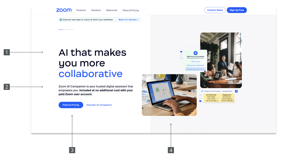
Let’s take a look at Zoom’s ATF on their homepage.

is the main header. Short and to the point. What is the benefit you are selling?
is the subhead. Further elaborate on benefits in your main header.
is the call to action. What do we want the visitor to do?
is the supporting imagery. Note the word supporting. It should be relevant and supporting the rest of the hero.
Zoom does a good job highlighting the benefits of their service and how to get more information/ take action. Do not leave your visitor guessing what they should do or where to go. Nudge them towards your desired action.
ATF’s Need to Adapt
Throughout the year, your organizational focus will shift, and so should the messaging. One of the biggest mistakes organizations make is not reflecting this priority. A simple, fast and effective approach is to fire-up Google sheets and brain-dump the next 3-6 months campaigns in a table. Don’t worry about the exact copy of the headers or the imagery, just get your campaigns out in the table as a start. This is a living document you will continually adjust with your team. I recommend putting a reminder on your calendar at least every 3 months to review this with your team.
Let’s look at another example. In the past year the non profit Feeding America consistently kept its hero section updated, reflecting the current priority. Via the WayBack machine, I was able to grab a few screenshots and include it below.

This isn’t an all inclusive list of their campaigns but demonstrates how the content calendar process works throughout the year. But what if you don’t have active campaigns every month? Leverage evergreen content to fill these gaps. Evergreen content or campaigns are not date specific and do not expire. It supports an ongoing goal throughout the entire year.
When manging all the pieces of your website, it’s easy to get stuck down in the weeds. Don’t forget the primary purpose of your website. What do you want your visitors to do? Make their job easy and minimize any friction to get the user to this end goal. In addition, for many organizations, goals change and/or are seasonal. Keep the ATF up-to-date and a reflection of you current objective(s).
Screenshots sources from zoom.com
Header image from Alberto Restifo on Unsplash
