Last weekend, we finally had a day to get outside. The weather forecast looked good, so we decided on a long day-hike with the kids. If you have ever gone on the trail for an extended amount of time or day hiked with kids, you know a little preparation goes a long way. Once out in the wilderness, conjuring up a bandaid or much needed snack is really hard to do. On the web, the same notion holds true. A little preparation before you launch your site or blog post pays big dividends down the road. One of the biggest culprits of slow sites and poor search engine optimization (SEO) scores is a lack of imagery preparation. “The probability of a bounce increases 32% as page load time goes from 1 second to 3 seconds.” A bounce is when a visitor visits a single page of your site and leaves. Not the desired goal for any website. There are endless ways to optimize your images, so I have five steps you need to watch for before you set out.
Image Size
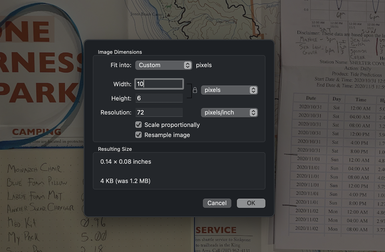
Image size is the number of pixels displayed in an image. The measurement consists of the number of pixel along the horizontal and vertical axis. To help visualize this, we will modify a copy of the image at the top of this blog post. Let’s update the image size to 10 pixels wide and width to 6 pixels tall.

We end up with…
You may of missed it, but that little speck above is 60 pixels. If we were to zoom in, it would look like…

Obviously, this isn’t something you want on your webpage, but it helps demonstrate the settings you control. How many pixels are needed in a given shape. A popular hero image size is 1920px by 1080px, or 1920 pixels wide by 1080 pixels tall. Here are a few more examples to use as a starting point:
- Background or hero: 1920px by 1080px
- Full page width: 1350px by 768px
- Half page width: 637px by 360px
- Third page width: 450px by 256px
- Quarter page width: 319px by 180px
Resolution
Image Resolution is how many pixels are displayed in a given unit of measurement. One of the most popular metrics is PPI or pixels per inch. For images on the web, the standard amount needed is 72 PPI and for reference when you print something it should be a minimum of 300 PPI. You can go beyond 72 PPI on the web, but very few will notice the difference and you will quickly bloat your file size.
File Type
Two of the most popular file types (for images) are JPG and PNG. There are many others but these two will be the primary two work horses. The general rule of thumb is to use JPG’s for photography. JPG uses a compression algorithm which helps dramatically cut down on file size. PNG’s on the other hand are lossless, which means no data is lost or compressed, which is why they look cleaner, crisper… and have a much larger file size. PNG’s should be used for illustrations (drawing, logo’s, etc.) and where transparency is required.
File Size (the result of image size, resolution, file type)
Image size, resolution, and file type are the primary factors in determining file size. The iPhone X’s photo size averages around 3 megabytes (MB). The average stock photo from ShutterStock is 12 MB. In 2021, the average speed of cellular networks was 21 megabits (Mbps) per sec. Apologies for all this math, but what this boils down to is a single iPhone image would require 1 second to download on a phone. This doesn’t sound like much, but there are usually more than one image on a page. You not only end up with incredibly slow pages but also search engines (like Google) pummel your search score, which pushes you further down the search results list. As a general rule of thumb, the majority of images should have a size between 50KB to 300KB, with the exception of a full screen image, which should be no larger than 1MB to 2MB.
Alternative (Alt) Text
When time and resources are short, it’s hard to slow-down and ensure you have adequately prepared for the journey ahead. Rushing through these critical prerequisites not only creates a frustrating user experience but also causes rework. Check these five areas (image size, resolution, file type, file size, alt. text) to ensure your website imagery is optimally performing. I hope this was helpful and if you run into any obstacles feel free to contact me.
Google/SOASTA Research, 2017.
https://www.statista.com/statistics/995096/average-cellular-network-speed-in-the-us/
