One of the first items addressed in my designs are user objections. This dips a little into the psychology of the user; we anticipate why they would not take you up on your offer. Maybe they are short on time, funds, or adequate information to pull the trigger. A short brainstorm session pays big dividends in identifying what you might come up against.
Let’s take a look at an example of where this is done well. Unless you have been living under a rock, you have heard about the popular ride-sharing company Lyft. On their homepage, they do an amazing job countering potential user objections. So what would some of these be?
- “I don't feel safe driving with a complete stranger.”
- “It's quicker to just flag a taxi versus set up the app.”
- “I need a job with flexibility, just not sure how this process works.”
Example #1: Rider safety

Addresses objection #1: “I don’t feel safe driving with a complete stranger.”
Lyft does a great job addressing passenger and driver objections with “Your safety comes first. Always.” Online resources are then available to understand the community guidelines.
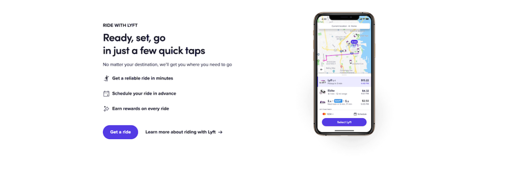
Example #2: Time Required

Addresses objection #2: “It’s quicker to just flag a taxi, then set up the app, then get a ride”
Lyft’s answer: “Ready, set, go in just a few taps”. Not only will the app require minimal setup, you get all of these other additional benefits.
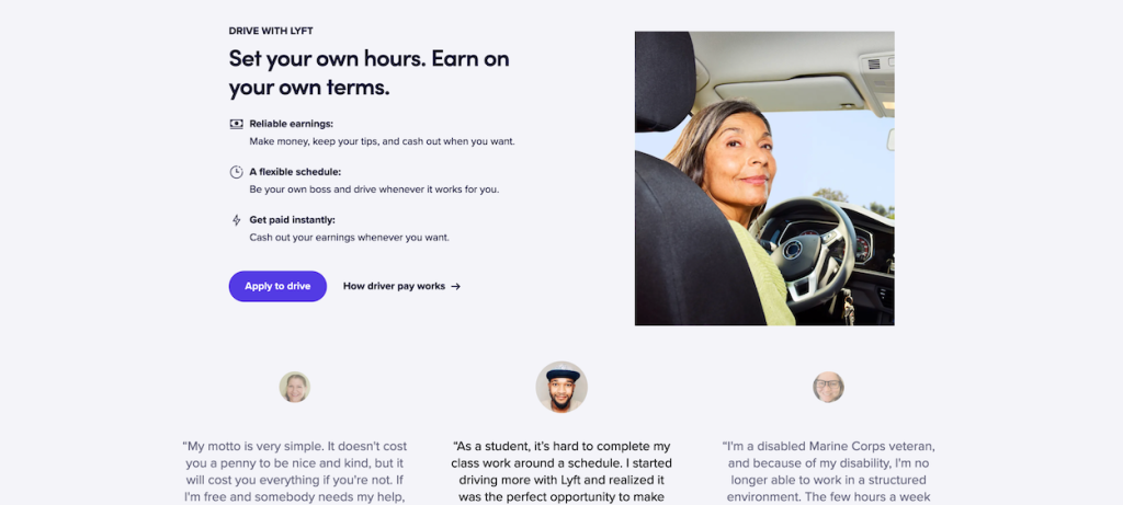
Example #3: Potential Benefits

Addresses objection #3: “I need a job with flexibility, just not sure how this process works.”
“Set your own hours. Earn on your own terms.” Ridesharing is a relatively new option for many folks. Addressing these key concerns and bumping up the benefits right-up front, helps move more people to drive, and a business goal conversion for Lyft.
It’s important to think about the flow from your visitors perspective. What are they worried about? What are some of their top concerns? What would keep them from reaching out to you? Anticipating these upfront will ultimately make you much more likely to achieve your business goal(s). If you need any assistance on this topic, let’s grab a coffee and hash out a few ideas to make your site more effective.
Screenshots sources from lyft.com
Header image from Nikola Johnny Mirkovic on Unsplash
