
In an earlier blog post, we talked about how to identify your brand personality . A very simple but effective route to identify your brand with 7 descriptive words. In this session, we take that baseline and put it in practice. Your brand personality should strongly influence and be consistent on your entire website.
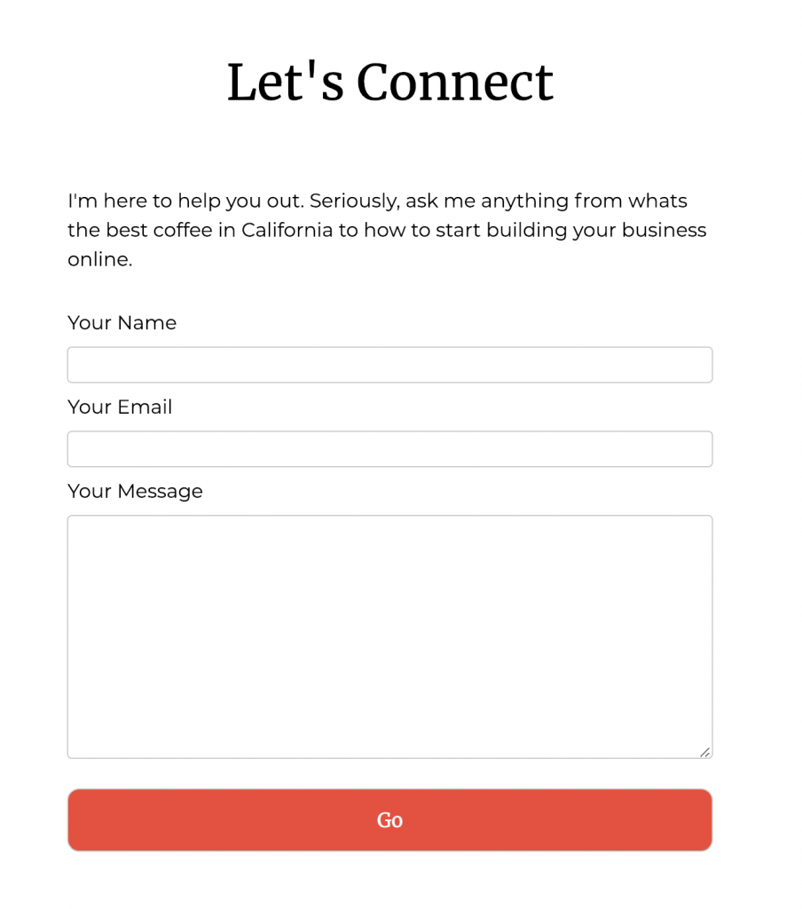
One of the most important elements that rarely receives the sufficient level of design love is the Contact Form. You are probably thinking, its just a form, what more is there? Just list out a few questions, get their email address and make sure there is a submit button, right? That is just the start.
A polished, succinct message to ‘contact me’ is saying ‘trust me, I got this’ and establishes confidence in your products and services. Consistency is key in establishing trust with your potential customers. Poor design can make them start to second guess their decision to contact you and ultimately bounce them to your competitors website.
So what is good design around a Contact Form? When I work with clients, we discuss these 5 major pillars…
- A clear understanding of what you want the form to accomplish
- An eye-catching and descriptive title
- Introduction paragraph, including the benefits you will provide
- A critical few questions to get you the needed information
- Your call-to-action button to submit the data
STEP 1 – YOUR OBJECTIVE
To start, grab a pen and paper and jot down your thoughts on “what do I want my visitor to do” or “what is the call to action”? In most cases, it’s new sales leads but also could be other items like providing customer service. This is your guiding star. Don’t overthink it. Just go with what pops into your head.
STEP 2 – YOUR TITLE
Depending on your brand personality traits, the verbiage of your “title” could vary quite a bit. For example, a “outspoken” vs. “reserved” title might look something like the following examples.
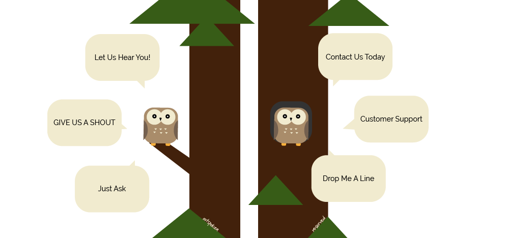
These small details come together to establish consistency and ultimately build trust.
STEP 3 – INTRO/BENEFITS
After your title is established, take a pass at a 1-2 sentence note. This is your chance to show who you are and depending on the type of questions, why you need this information.
To start, let’s switch places with you and your potential customer. Ask yourself…what pain-points could they be encountering? How does your product or service solve these problems?
For example on my site, most visitors are small businesses or organizations with no graphic design or IT department. With an overwhelming number of options, they need someone to help them get started. With my brand leaning more on the casual-side, I roll with…
STEP 4 – CRITICAL QUESTIONS
Now we get to jump into the deep-end with the questions. Keeping it simple is the hardest challenge. It’s very easy to overload your form.
How many times have you wanted to contact someone but never did because you stumbled upon an overwhelming number of questions that took too long to answer? It happens way too often and is a huge blocker to finding new customers or keeping your existing customer happy.
Studies* on the relationship between the optimal number of questions and the conversion rate, show there was a …
- 25% conversion rate with only 3 fields
- 20% conversion rate with 3-5 fields
- 15% conversion rate with 6+ fields
The lesson here is to keep it short and simple.
STEP 5 – CALL-TO-ACTION BUTTON
The final piece to the puzzle is that shiny button at the bottom of the form, also the called the submit button or call-to-action (CTA).
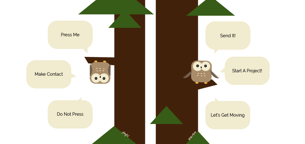
If there is one quick win you can employ in this entire post, it’s DO NOT use the word ’submit’ on your button.
“Forms using ‘Submit’ have an almost 3% decrease in conversion rate”
* Hubspot
Other terms such as ‘Click Here’ and ‘Go’ fared better in these studies. But it’s also important to remember which tone to use from your brand exercise. For example, on the question whether your brand is “playful” vs “assertive”, you could run with the following…
I hope you found these tips useful. Here’s a quick recap…and if you still need help with your site (or want to know the best coffee in California), please give me a shout.
- Be clear on your objective. Know where you are going.
- Grab them at “hello”…use your brand voice to get their attention. Make it clear…what’s in it for them
- Less is more. You don’t want this to feel like they’re doing their taxes
- Be yourself – even with your call-to-action button. Brand voice. Brand voice. Brand voice.
Additional sources
