A footer is the bottom section of your website, a component that typically receives the least amount of design attention. As the name implies, it’s not making the first impression (like the hero section) but in many cases, but it’s the last thing they see before they leave your site. Typically, this area is bare-bone containing very dry content like legal notices, disclaimers, etc. Don’t get me wrong, this basic information is important but you are missing a ton of opportunities if this is all you have. Below are a few reasons why you should consider investing a little time when designing and crafting this section.
Catch a Lost User
Very few visitors will spend the time to read every word on your webpage. So there is a good chance they could easily blow-by a key piece of content. Instead of allowing your visitors to hit an empty bottom on your webpage, offer an opportunity to catch the user and redirect them back on the right path. A copy of your main navigation, search functionality, or even a contact form are a few worthy candidates
The following is a great example (from Envoy) of a simple clean safety net in footer.

Give Your Site a Consistent Feel
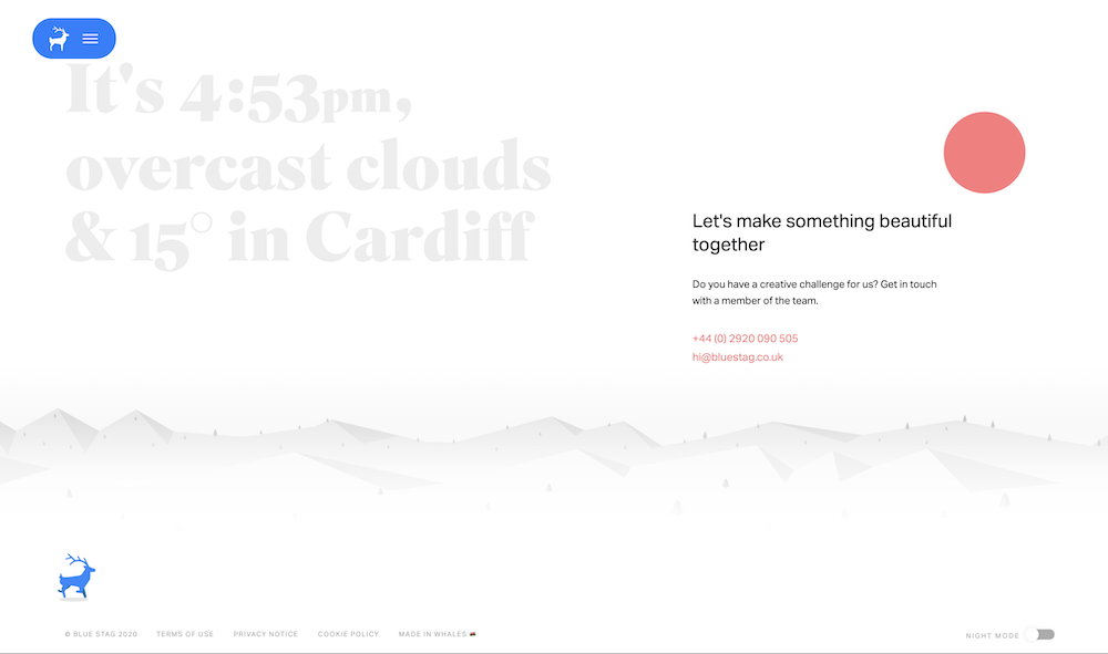
Your brand personality should shine consistently on every component of your website. When visitors come to the bottom of your site, it shouldn’t feel like you landed somewhere else. Recently I stumbled across Blue Stag’s website, a creative digital agency in Whales. The following is their footer…

The site’s clean, modern, and friendly feel persists all the entire experience. I have never been to Cardiff (the capital of Whales), but I feel like I have a connection with these folks just by the friendly nature of their Call to Action in their footer. It’s also important to note how much “real estate” their footer takes up. It uses a lot of space, but that’s not a bad thing. It’s inline with their entire site and helps further support of agency’s brand.
An Opportunity to Strengthen CTA’s
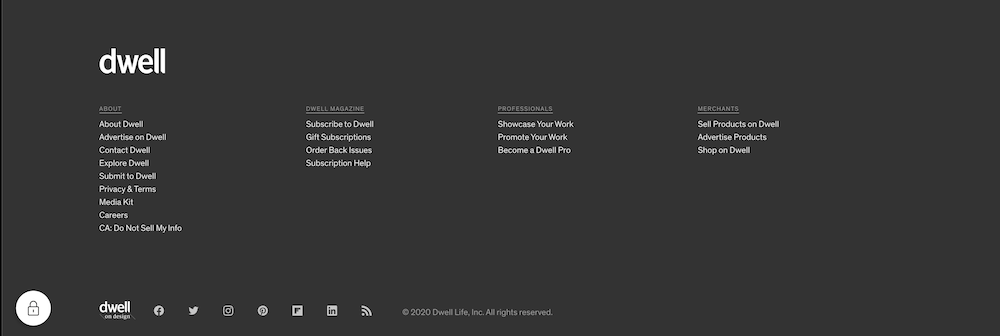
When you are diving deep in the weeds, setting up your website it can be easy to forget the overarching goals. What am I trying to accomplish with this site: lead generation, customer support, etc. Keeping these goals in mind will help ensure the site design and call-to-actions (CTAs) are on target. As mentioned above, the website footer is often the last thing folks see before they leave your site. Ensure your critical CTAs have some real estate down there. Don’t worry about redundancy across your site. Repetition and reinforcement are what people remember but use this tactic sparingly.
Dwell‘s site utilizes this tactic and also break out the CTA by audience group.

Footers are a key element in a website. I hope this article helped illustrate why a little footer TLC can go a long way. If you need some help with your site’s footer, contact us and we will guide you through the way to design an amazing footer.
Cover photo by Jack Hunter on Unsplash
